Visual Identity: Minimalism is Back in 2026
TL;DR
- The Neo-Minimalist Shift: 2026 marks the end of "sterile" white space; "Warm Minimalism" introduces texture, earthy tones, and high-contrast serifs to build trust.
- Typographic Authority: Bold, expressive typography is replacing generic logos, serving as the primary "voice" of the brand in a mobile-first world.
- Clutter-Free Conversion: Minimalist layouts on platforms like Agentr.ee reduce decision fatigue, guiding prospects to take action 40% faster.
- Visual Premium: High-contrast palettes (e.g., Deep Slate and Cloud Dancer) signal "Quiet Luxury," helping agents justify higher commissions through design.
Your brand needs to look good on a screen the size of a credit card.
The era of the "Busy" brand is officially dead.
If your 2026 marketing materials are still crowded with complex logos, three different script fonts, and five overlapping primary colors, you aren't just looking dated, you are actively creating "Decision Fatigue" for your leads. We have reached a point of digital saturation where the human eye is desperately seeking a place to rest. Every day, your sphere of influence is bombarded by thousands of flashing ads and "Look at Me" graphics. If your brand joins that choir of chaos, you become invisible.
In 2026, the most powerful visual signal a realtor can send is clarity.
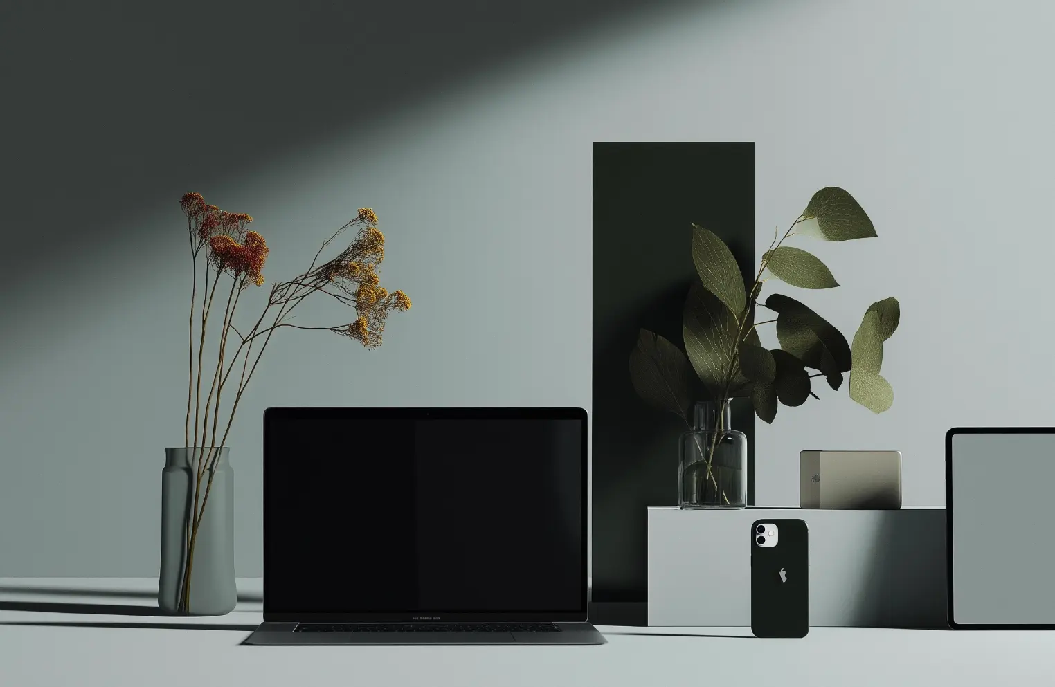
But do not mistake this for the "Greige" sterile look of 2020. Minimalism is back, but it has been re-engineered. We call it Neo-Minimalism, or "Warm Minimalism." It is a design language that combines the surgical precision of high-contrast layouts with the "Human Signature" of tactile textures. It is about removing the "fluff" to let your personal branding and your property data speak for themselves.
From Sterile to "Warm" Minimalism
Why did the old minimalism fail? It felt cold. In real estate, where trust is the primary currency, "cold" is a deal-killer. No one wants to hire a robot to sell their family home.
The 2026 update replaces stark, blue-light whites with "Cloud Dancer" (a soft, warm off-white) and deep, grounded tones like Charcoal, Terracotta, or Sage. By using these organic palettes, you create a visual identity that feels premium yet approachable. You aren't just a faceless agent at a big-box brokerage; you are a sophisticated advisor. Updating your brand identity with these tones signals "Quiet Luxury", the idea that you have nothing to prove and everything to offer.
Have you noticed how the high-end boutique hotels are designed lately? They aren't cluttered. They use light, shadow, and material. Your digital presence should mirror that. If your lead gen landing page looks like a coupon circular, you will attract coupon-seeking clients. If it looks like a curated gallery, you attract the portfolio-minded sellers.
Typographic Authority: The New Logo
In 2026, your name is your logo.
We are seeing a massive trend where complex graphic marks, the houses, the keys, the abstract rooftops, are being ditched in favor of bold typography. High-contrast serifs, think elegant, sharp, and slightly expressive, are dominating the landscape. This is "Typography as Identity." When you use a bold, character-led typeface for your name, you are projecting a "Foundational Authority" that cuts through the noise of a crowded Instagram feed.
This trend works perfectly for Instagram for Realtors because bold type remains legible even on the smallest smartphone screens. It is a mobile-first design philosophy. By using a service like Agentr.ee, you can host this bold visual identity on a micro-site that prioritizes these clean lines. It ensures your brand looks as sharp in a direct message as it does on a luxury sign rider. Why hide your name behind a tiny, unreadable icon when your name is the brand?
The Power of High Contrast and Zero Clutter
High contrast isn't just about black and white; it’s about visual hierarchy. It is about telling the user's eye exactly where to look first. When you strip away the unnecessary borders, the tiny "Just Listed" banners, and the redundant contact info, you allow the property and the data to become the star.
In 2026, the "Zero Clutter" movement is a response to the "Chaos Packaging" seen in low-end lead-buying sites. Realtors who embrace a minimalist visual identity appear more organized, more professional, and frankly, more expensive.
This directly impacts your closing ratios. When a prospect lands on your bio link and sees three bold buttons and one stunning property photo, the path to the "next step" is clear. You have removed the friction. You have respected their time. You have signaled that you are the architect of a streamlined experience. If your website is a mess, the client assumes the transaction will be a mess, too.
Vibe Coding Through Digital Texture
If the design is minimal, how do you prevent it from looking "default"? The answer is texture. In 2026, we use "Digital Texture" to add depth. Think of a background that has a subtle "Paper Grain" or a "Linen" feel. It adds a sensory richness that makes your digital presence feel less like a glowing screen and more like a physical asset.
This is part of the Founder Brand evolution. You are showing that you care about the details, the same way you would care about the finishes in a $2M listing. It creates a "Vibe" that resonates with high-net-worth clients who are tired of the glossy, plastic look of 2024.
The SEO of Minimalist Design
Minimalism isn't just an aesthetic choice; it’s a strategic SEO choice.
Heavy, cluttered websites with too many elements, scripts, and trackers slow down load times. In 2026, "Speed is Rank." A minimalist, high-contrast brand identity built on a platform like Agentr.ee ensures that your "Digital Front Door" opens instantly. Google’s algorithms, and the emerging AI search engines (GEO), prioritize sites that are easy to crawl and provide a "Breathe-able" user experience.
By reducing the clutter, you are making your brand more searchable. You are helping the machine understand that this is the agent, this is the neighborhood, and this is the offer. When you stop trying to say everything at once, the algorithm finally hears what you are saying.
Transitioning Your Brand Today
How do you begin? You start by auditing your current "Visual Debt."
- Look at your business card. If it has more than two fonts, fix it.
- Look at your Instagram highlights. If the icons are complex illustrations, replace them with bold, single letters or solid colors.
- Look at your bio link. If it's a long list of fifteen links, cut it down to three high-value actions.
Minimalism in 2026 is about the "Power of the Edit." You are showing the world that you are an agent who can filter out the noise. In a market full of distraction, the person who provides the most clarity wins the most trust.
The Bottom Line
Visual identity is the first "listing" you ever present to a client. If the design is cluttered, they will assume the transaction will be cluttered, too. By embracing Neo-Minimalism—bold type, high contrast, and warm, earthy tones—you aren't just updating your look; you are updating your authority.
Stop hiding your expertise behind a messy brand. Strip away the noise, let the typography lead the conversation, and use a streamlined hub like Agentr.ee to anchor your new identity. In the age of digital chaos, the agent who speaks with the most clarity is the one the market hears the loudest. Less isn't just more; in 2026, less is the only way to be seen.